Layouts, designs, content types & content
Getting content onto a screen involves four layers:
- a layout — named, positioned containers
- a design — the instance-wide skin (colors, backgrounds, per-container styling)
- a content type — a reusable field schema, bound to one layout
- content — an actual item, filled in from a content type's fields, assigned to the screens that should show it
Layouts
A layout (Layouts page, /layouts) is a named, reusable group of
positioned containers. A dropdown at the top of the page switches which
layout you're editing; New starts an empty one, Save as New
duplicates the current layout (its containers are shared with the original,
not copied — see below), and Delete Layout removes it (blocked if a
content type is currently bound to it).
The canvas is a (for now) fixed 16:9 area, with every container's position stored as a percentage of it (top/left/width/height) so layouts scale to any screen resolution. The preview also renders the current default design live, so you're positioning containers against the real background rather than a blank grid.
Adding containers:
- Click-drag empty canvas space to draw a brand-new container, or use the New Container button to drop one in at a default size.
- Drag an existing, unassigned container in from the sidebar to reuse it in this layout instead of creating a new one.
Positioning:
- Drag a container's body to move it, or one of its four corner handles to resize it (the opposite corner stays anchored).
- Snaplines — shared globally across every layout — help align containers. Add one from an axis (horizontal/vertical) and a percentage position; it's drawn as a red guide line and can be removed again via its chip. While dragging, containers snap to the canvas edges/center, to the edges and center of every other placed container, and to snaplines, within a small threshold.
- Position/size edits are staged locally and only sent to the server when you click Save. Adding, removing, or deleting a container, on the other hand, happens immediately.
Containers are shared, standalone entities — a container's position/size is the same everywhere it's used, so editing it in one layout moves it in every other layout that includes it too. Deleting or repositioning a container that's reused elsewhere warns you which other layouts are affected. A container can't be deleted while a content type has a field bound to it.
Each container can optionally have a default field handler and matching default content — an editor tailored to that handler (color pickers, size fields, a table builder, etc.) opens from the container's own settings. This default is what renders whenever no active content currently targets that container. The available handlers are: Short text, Long text, WYSIWYG, Number, Link/URL, Image, Icon, Arrow, Date/Time Format, Table, Pretalx Table, Raw HTML, iFrame, Marquee (scrolling text), or None.
There's no per-screen "this screen uses layout X" assignment — a layout's only job is to group containers and scope which containers a content type may target (see Content types below). Every screen shares the same set of layouts and the same active design.
Designs
A design (Designs page, /designs) is the instance-wide visual skin.
The list lets you Make Active (flips the one isDefault design — active
for every screen at once), Copy (duplicates HTML/CSS/description under a
new name), or Delete a design. The editor is a set of collapsible
panels, layered in this order (later panels win over earlier ones):
- Default Colors — a named color palette scoped to this design. Every color picker elsewhere in the editor can either pick a one-off color or reference a palette entry by id; referencing entries means editing one palette color updates every place that references it at once, instead of having to change each occurrence individually.
- Backdrop — a Background panel (image via the media picker, repeat/size/opacity, fallback background color) stacked with a Gradient panel: pick one or more gradients from a reusable gradient library (linear, radial, or conic; repeating toggle; angle or shape/size for radial; position; any number of color stops, each with its own color, position, and opacity, optionally referencing a Default Color) — multiple gradients layer as stacked CSS backgrounds.
- Background Effect — an optional animated canvas background (particle fields, waves, etc.), picked from a dropdown of effect types with optional presets and per-effect parameters (numbers, colors, color arrays), with a live inline preview while you tune it.
- Global Styles — font and layout properties (family from a websafe list, variant, weight, stretch, size in vh, line-height, style, color, text-align, display, justify-content, align-items) applied to every container by default.
- Per-Container Styles — the same property set as Global Styles, but scoped to one specific container at a time (one collapsible panel per container), overriding the global values just for it. Changes here autosave.
- Custom HTML and CSS — hand-written HTML/CSS for anything the
structured options above don't cover; it always renders last and wins
over every other panel. You can drag or click Magic Tags
chips into this HTML/CSS to insert instance-wide
{{ var_name }}placeholders (e.g. a Wi-Fi password or venue name) — this is the only place in a design where magic tags apply.
Content types
A content type (Content Types page, /contenttypes) has a name, an
optional description, and is bound to one layout. Its field list isn't
picked by hand — it's synced automatically, one field per container in the
chosen layout: switching a content type to a different layout adds fields
for that layout's containers and drops the ones that no longer apply. This
also means a content type's fields always map to real, current containers —
there's no separate "which containers can this content type target" step.
For each field you can set:
- A title — the label shown above the field in the Content editor and used as a header wherever the content renders.
- A field handler — the same set available for a layout container's default content (short text, long text, WYSIWYG, number, link/URL, image, icon, arrow, date/time format, table, Pretalx table — see Pretalx — raw HTML, iFrame, marquee, or none). Leaving a field as None means it has no input of its own and always falls back to showing its container's default content.
- Drag-to-reorder — the order fields appear in both the Content editor and the rendered output.
Opening a field's preset panel lets you set a default value for it, and independently lock (kept editable, but pre-filled) or hide (fixed, not shown at all) each individual part of that value in the Content editor — for example an icon field's icon and its size can be locked/hidden separately, and a table or Pretalx table field's many sub-options can each be controlled on their own. This is what lets you reuse one content type for several purposes while only exposing the parts each use case should be able to edit.
A Copy action on the list duplicates a content type, including its field configuration, under a new name.
Creating content
On the Content page (/content), the list can be filtered by screen, by
screen group, or to just unassigned ("abandoned") content, and supports
searching by title or by any field's rendered value.
To create an item:
- Pick a content type from the card grid.
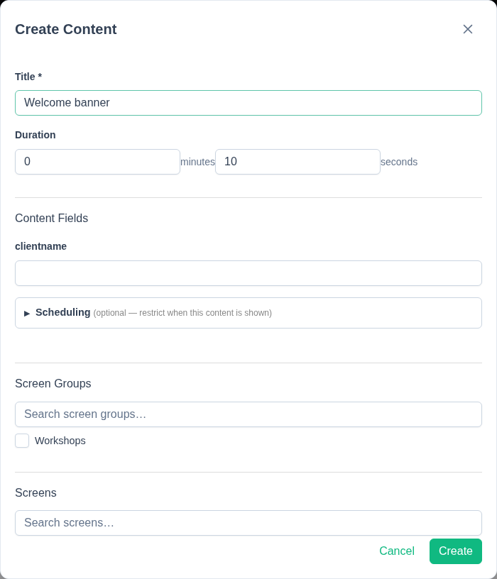
- Fill in a title and a duration (minutes + seconds).
- Fill in the content fields — each rendered with a widget appropriate to its handler (a rich-text editor for WYSIWYG, an image picker with single-image or random-from-tag modes, an icon/size picker, a table editor, the full set of Pretalx table options, etc.), with any locked/hidden sub-options from the content type respected.
- Optionally expand Scheduling to set a start/end date-time — an active-window outside of which the content won't show, even if otherwise assigned.
- Assign it to the screen groups and/or individual screens that should show it, via searchable checkbox lists. There's no manual per-container assignment step — where the content lands on the screen is determined entirely by which container each field maps to in the content type's layout.
While editing, a live, sandboxed preview re-renders on every field change, showing the design and layout with your in-progress values — useful for checking a change before it goes out to real screens. If you're editing content that's already live on one or more screens, a warning banner lists every screen it will affect before you save.
Saving pushes the change to every screen showing that content immediately — there's no separate publish step.